The short answer
A commercial vehicle wrap can be one of the most visible forms of advertising a business uses.
Once it is printed and installed, the design is no longer just a file on a screen.
It is now attached to a moving vehicle that may be seen by thousands of people.
That is why the proofing stage matters.
A few minutes spent reviewing the design carefully can prevent expensive mistakes later.
Content and readability
Start With the Basic Information
Before looking at colors or layout, check the simple things first.
Make sure the following are correct:
- Business name
- Phone number
- Website
- Social media handles
- Service list
- Address if included
- License or certification numbers if required
These are the details customers may actually use to contact you.
A typo in a phone number can make an otherwise great wrap useless.
Check the Spelling
Read every word.
Do not assume the designer has already caught every mistake.
Pay close attention to:
- Business name
- Service names
- Town names
- Website address
- Taglines
- Small print
If several people are involved in the business, have someone else review the proof too.
A fresh set of eyes often catches things that the person closest to the project misses.
Make Sure the Contact Information Is Easy to Read
A vehicle wrap is not a business card.
People may only see it for a few seconds.
The phone number and website need to be large enough to read quickly.
If the contact information is too small, too busy, or hidden inside the design, it may not work well in the real world.
The design should look good, but it also needs to communicate.
Think About the Vehicle From a Distance
A wrap can look great when viewed close-up on a computer screen and still be hard to understand from across a parking lot.
Ask yourself:
- Can I tell what the company does quickly?
- Is the business name obvious?
- Is the main message clear?
- Is the phone number readable?
- Does the design still make sense when the vehicle is moving?
If the answer is no, the design may need to be simplified.
Check Both Sides of the Vehicle
Do not assume the driver and passenger sides will look exactly the same.
Doors, fuel fillers, handles, body lines, and other features can change the layout.
Review both sides separately.
Make sure important information is not blocked by:
- Door handles
- Sliding doors
- Body seams
- Fuel doors
- Wheel openings
- Trim
- Other vehicle features
The design needs to work on the actual vehicle, not just on a flat template.
Pay Attention to the Rear
The rear of the vehicle can be one of the most valuable advertising areas.
People may sit behind the vehicle at traffic lights for several minutes.
That makes it a good place for:
- Business name
- Phone number
- Website
- Main service
- Simple call to action
Do not overload it.
The rear should be easy to understand at a glance.
Fit and artwork
Watch Where Important Text Crosses Panel Gaps
Commercial graphics are installed over real body panels.
That means doors open.
Panels move.
Body gaps create interruptions.
Important words should not be placed in areas where a panel gap makes them difficult to read.
The same applies to logos and phone numbers.
A well-designed wrap should account for those areas before printing.
Check Door Handles and Hinges
Handles can cover part of a word or logo.
On vans and trucks, hinges can also affect the design.
Those things are easy to overlook on a screen.
Before approving the proof, make sure no important part of the design depends on a handle, hinge, or trim piece lining up perfectly.
Look at the Wheel Areas
Wheel openings remove a large amount of usable space.
Text placed too close to a wheel arch can be difficult to read.
It can also make the design feel crowded.
Make sure important information has enough room around it.
Check the Colors
The colors you see on a screen may not look exactly the same once printed.
That is normal.
Screens produce light.
Printed graphics reflect light.
The final appearance can also change depending on:
- Vinyl
- Laminate
- Lighting
- Vehicle color
- Print process
- Viewing angle
If a very specific brand color is important, mention that early in the design process.
Make Sure the Vehicle Color Works With the Design
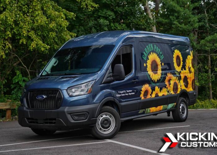
Not every commercial project is a full wrap.
Some use the factory paint as part of the design.
That can be very effective, but the vehicle color needs to be considered.
A design created around a white van may not work the same way on a black truck.
The factory color should be treated as part of the overall design.
Check the Logo Quality
Low-resolution logos can look acceptable on a phone or computer but poor when enlarged across a vehicle.
Whenever possible, provide the original logo file or a high-quality version.
The same applies to:
- Photos
- Illustrations
- Icons
- Background images
If the source file is poor, printing it larger will not fix it.
Proof and approval
Confirm Any Photos or Artwork You Provide
If the design includes photos or artwork, make sure:
- You own the image
- You have permission to use it
- The file is high enough quality
- The image actually represents your business correctly
Avoid pulling random images from the internet.
That can create both quality and ownership issues.
Make Sure the Service List Is Not Too Long
It can be tempting to list every service the business offers.
That usually creates a cluttered design.
Focus on the services that matter most.
The goal is not to turn the vehicle into a full website.
The goal is to make people understand the business quickly.
Think About Future Changes
Before printing, consider whether any information is likely to change soon.
For example:
- Phone number
- Website
- Social handles
- Service area
- Licensing
- Business name
- Main services
If something is already expected to change, it may make sense to wait before printing.
Replacing a small decal later may be simple.
Changing a major part of a full wrap can be much more involved.
Practical Wrap Proof Checklist
Before approving the final proof, check the following.
Business Information
- Is the business name correct?
- Is the phone number correct?
- Is the website correct?
- Are social handles correct?
- Are licenses or certifications correct if included?
Spelling and Wording
- Is every word spelled correctly?
- Are service names accurate?
- Is the message easy to understand?
Layout
- Is the logo easy to see?
- Is the phone number readable?
- Is the website readable?
- Are important elements clear from a distance?
- Is the design too crowded?
Vehicle Fit
- Have both sides been reviewed?
- Has the rear been reviewed?
- Are handles blocking anything important?
- Are hinges or panel gaps causing problems?
- Are wheel openings affecting the layout?
- Are sliding doors accounted for?
Colors and Graphics
- Are the colors approved?
- Is the vehicle color part of the design?
- Are logos high enough quality?
- Are all supplied photos and graphics approved for use?
Final Approval
- Has more than one person reviewed the proof?
- Is all contact information current?
- Are there any upcoming changes that could make the design outdated?
- Are you comfortable approving the design exactly as shown?
Do not rush this step.
Once the project is printed, changing the design can mean reprinting material and adding labor.
How We Handle Proofing at Kickin’ Customs
We want the customer to understand exactly what they are approving before anything is printed.
That means reviewing the layout, wording, contact information, colors, and vehicle placement.
We can help identify design concerns, but the customer still needs to confirm that the business information is correct.
The final approval should only happen when everyone is comfortable with the design.
Final Thoughts
A commercial wrap is a large advertising investment.
The proofing stage is where many expensive mistakes can be prevented.
Check the spelling.
Check the phone number.
Check the website.
Look at both sides.
Look at the rear.
Think about how the vehicle will actually be seen on the road.
A strong design should look good, fit the vehicle properly, and communicate the business clearly.
That is what makes the proof worth reviewing carefully before printing.